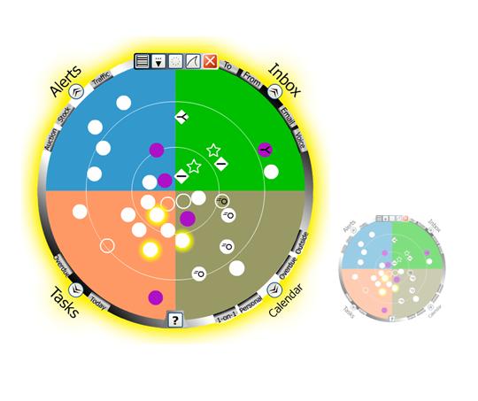
Important items are closer to center.
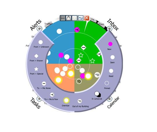
Legend for symbols.
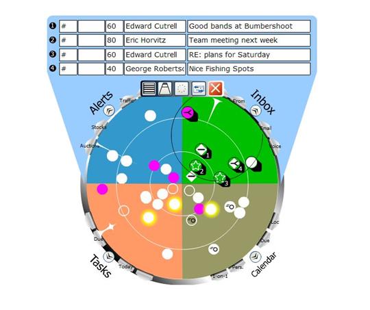
Sweeping out a region and review of items in a list box.
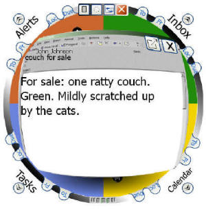
Frame from "crystal-ball" animation of incoming message.
Click here to explore several aspects of Scope design.
M. van Dantzich, D. Robbins, E. Horvitz, and M. Czerwinski
We describe the design and functionality of the Scope, a glanceable notification summarizer. The Scope is an information visualization designed to unify notifications and minimize distractions. It allows users to remain aware of notifications from multiple sources of information, including e-mail, instant messaging, information alerts, and appointments. The design employs a circular radar-like screen divided into sectors that group different kinds of notifications. The more urgent a notification is, the more centrally it is placed. Visual emphasis and annotation is used to reveal important properties of notifications. Several natural gestures allow users to zoom in on particular regions and to selectively drill down on items. We present key aspects of the Scope design, review the results of an initial user study, and describe the motivation and outcome of an iteration on the visual design.
Keywords: Information visualization, Notification Platform project, peripheral displays, awareness, notifications, interruptions, alerting and notification systems.
In: Proceedings of AVI 2002, ACM Conference on Advanced Visual Interfaces, Trento, Italy, May 22-24, 2002. ACM Press.